
Key Features
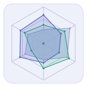
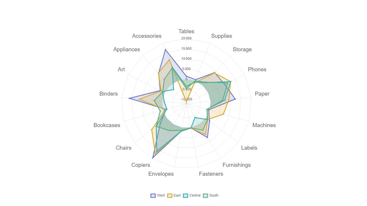
- Multi-axis radial chart layout
- Overlay multiple data series for comparison
- Customizable axis labels and scales
- Interactive legend
Use Cases
- Employee skill assessments
- Product feature comparison
- Competitive analysis scorecards
- Performance profiling across KPIs
Seamless Integration
Fully Integrated with Tableau
Not just a standalone chart — Radar works as a first-class citizen in your Tableau dashboards with full bi-directional filtering.
Select a data series to filter other sheets by the corresponding category
Apply external filters to dynamically update which series are displayed on the radar
Use as a dashboard action source for cross-sheet filtering
Explore Other Extensions
Circular Sankey
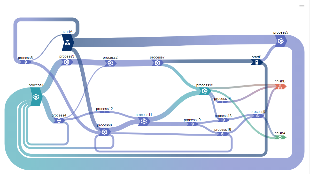
Visualize complex flows in a stunning circular layout. Perfect for showing relationships, transfers, and migrations between categories.
Sankey
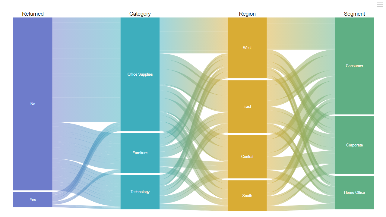
Classic flow diagrams that show magnitude of movement between stages. Ideal for process analysis, budget flows, and customer journeys.
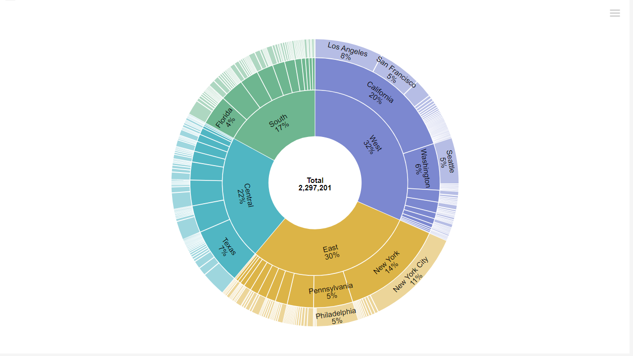
Sunburst
Hierarchical ring charts that reveal part-to-whole relationships across nested categories. Great for org structures and file systems.
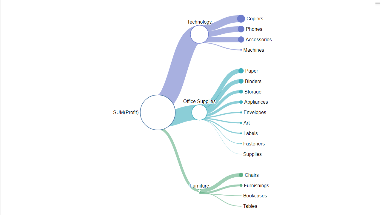
Tree
Interactive tree diagrams for exploring hierarchical data — org charts, taxonomies, and decision trees rendered beautifully. Switch to radial mode to unfold your hierarchy in a circular, space-efficient view.